The Challenge
Phool Gully is a modern gifting brand inspired by Mumbai’s flower markets. How do we tell a story that speaks to memory and emotion, for those who long for home, and those discovering it for the first time?
The Insight
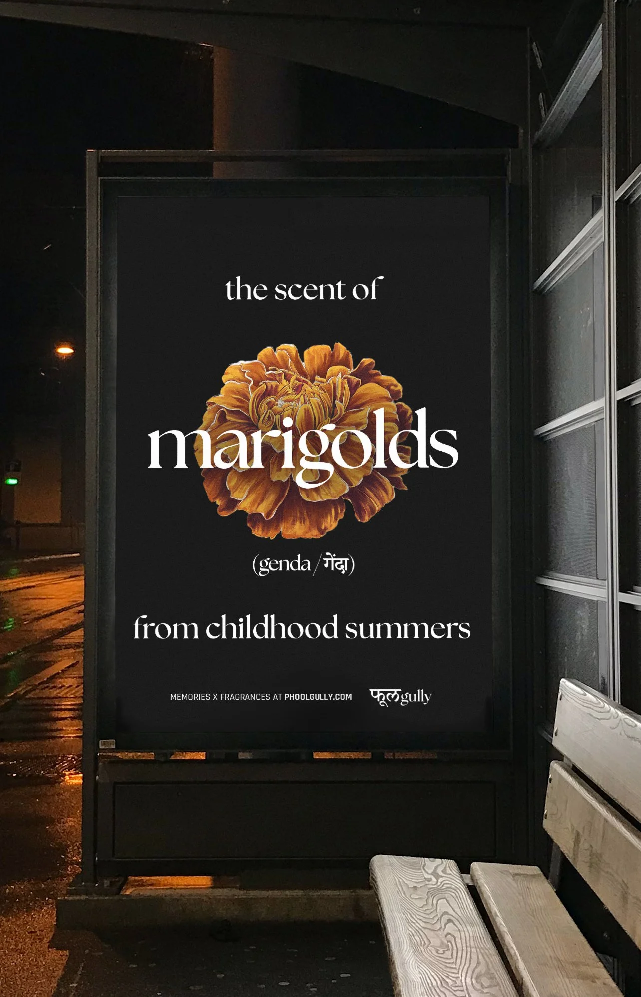
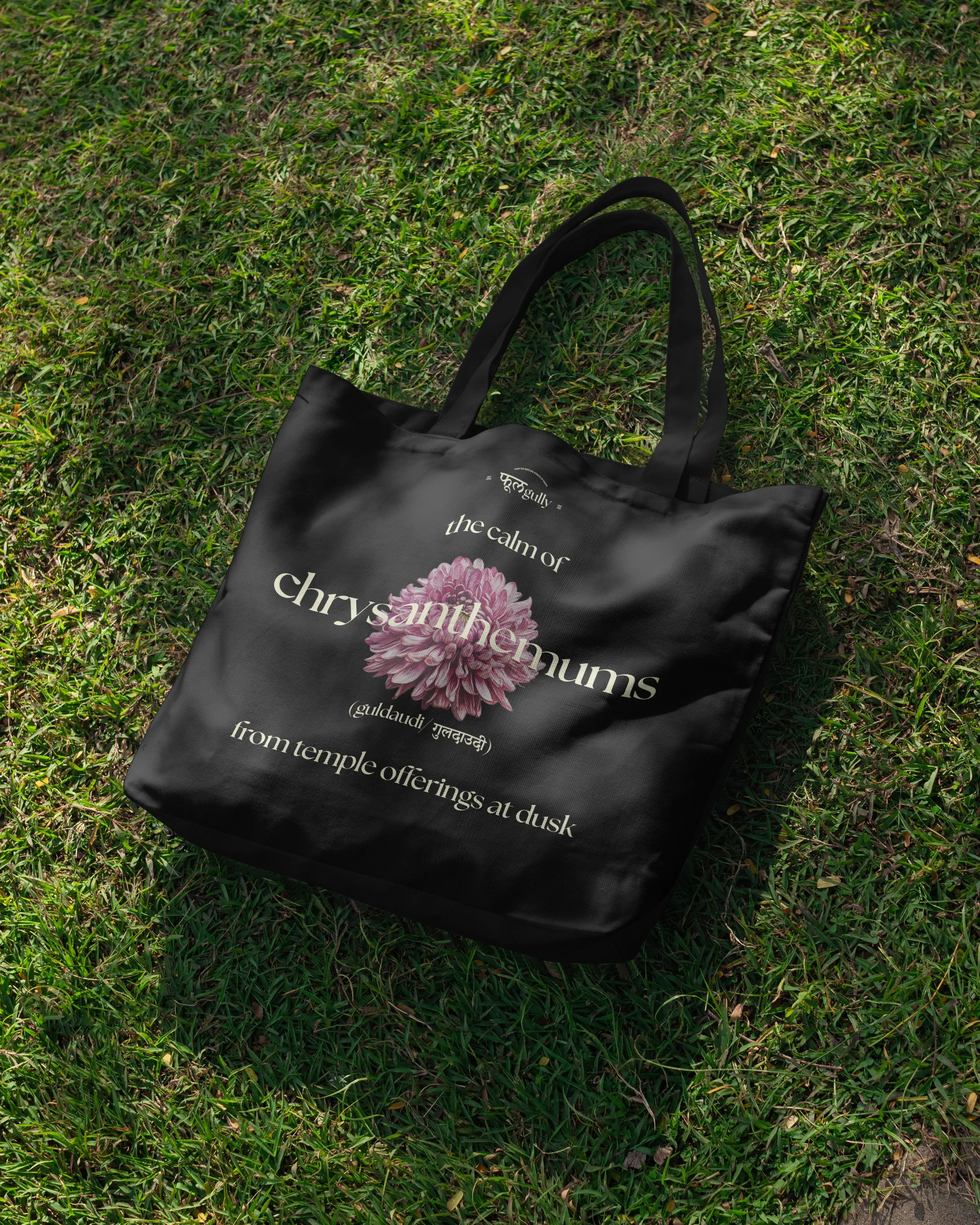
The scent of Indian flowers stirs something deep: nostalgia, belonging, and wonder, whether remembered or imagined.
The Solution
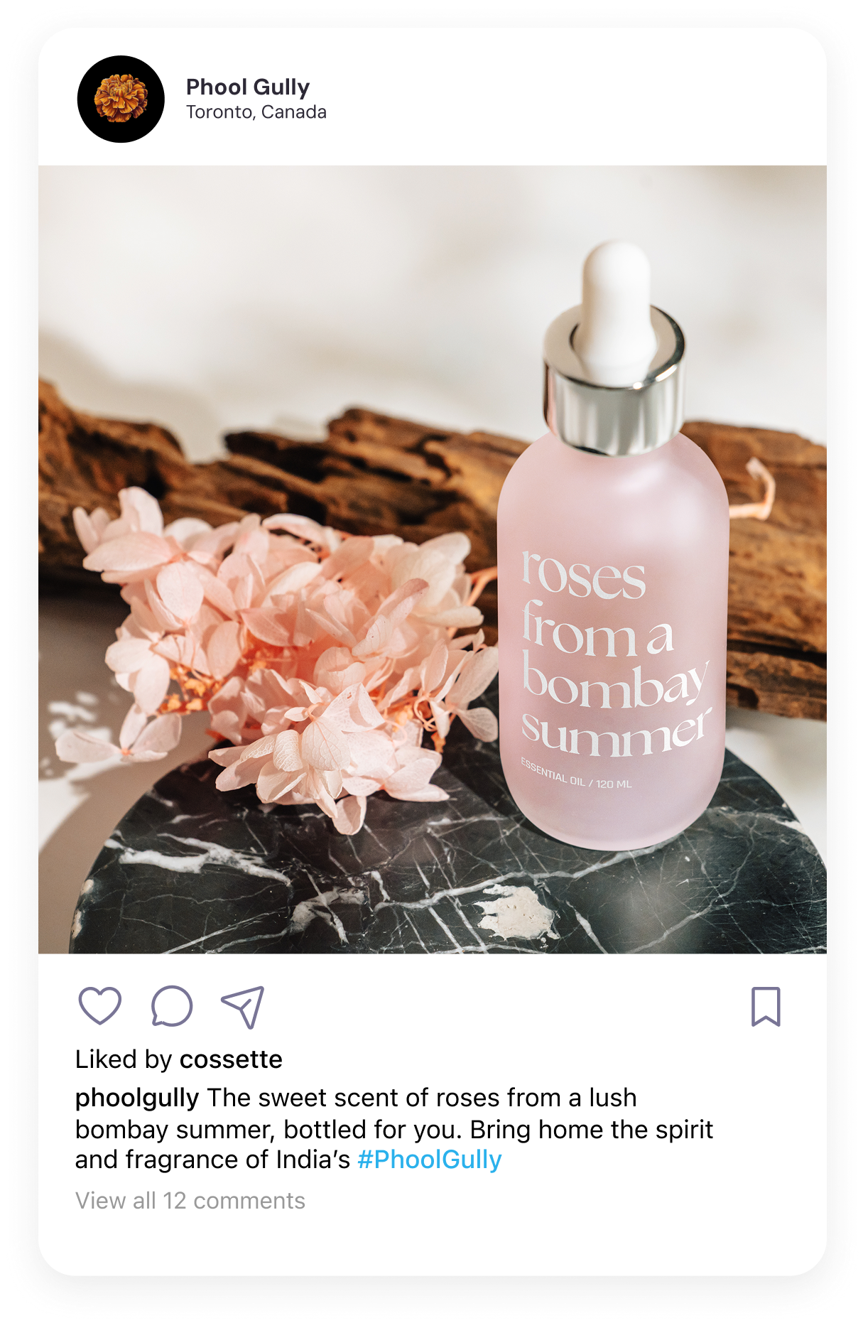
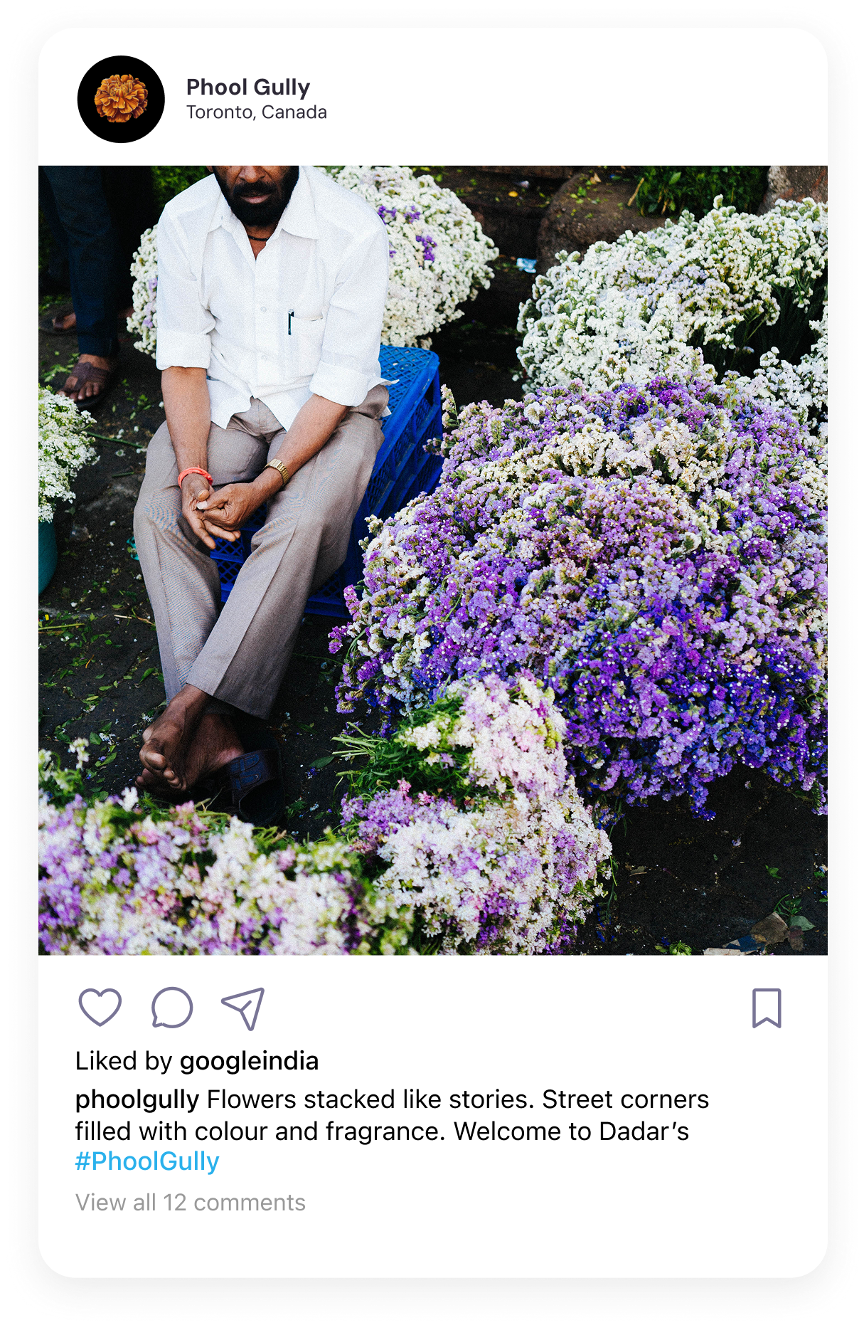
A visual identity and campaign built around flower illustrations and street photography —bridging heritage and discovery through vibrant, contemporary design.
Role:
Creative direction
Visual identity
Graphic assets
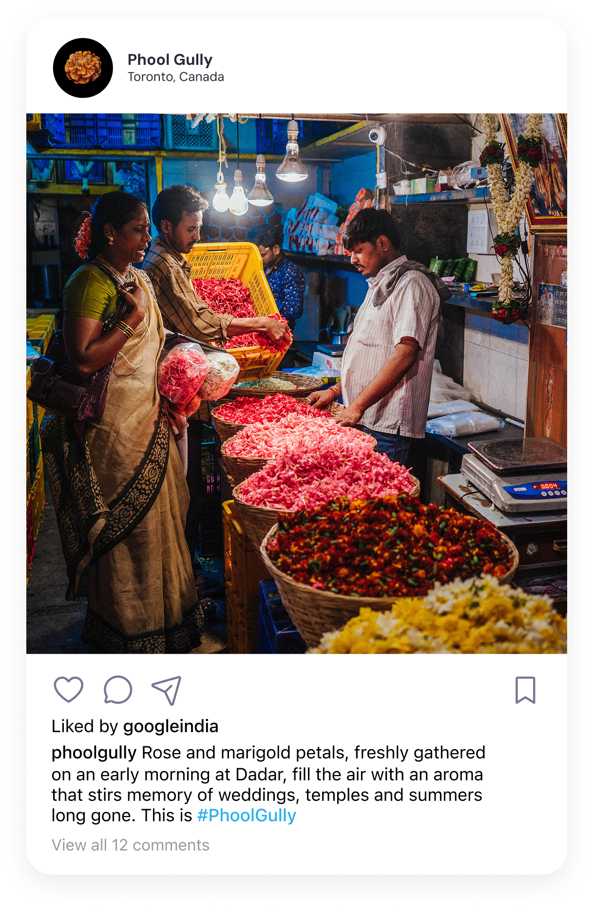
Photography


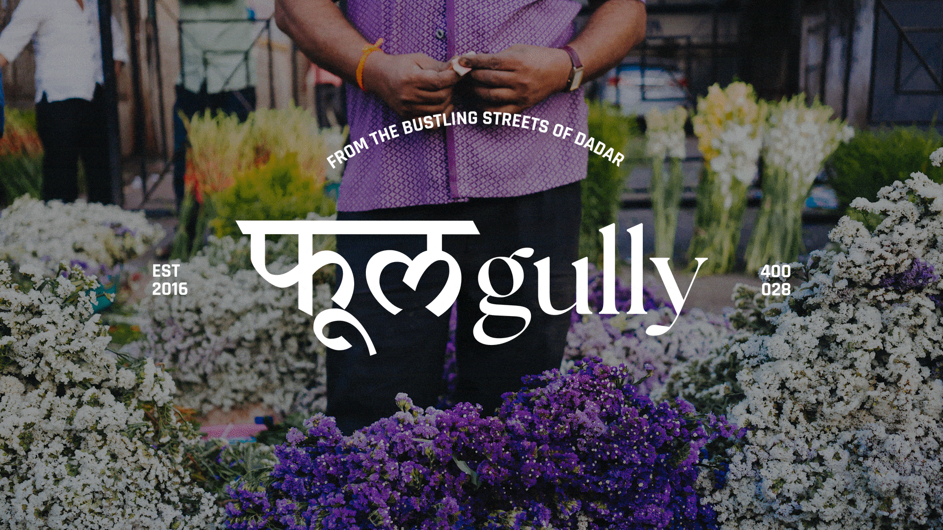
A note on the Word-mark & Typography
The word-mark, फूल Gully, blends Hindi and English to reflect its ethos of bringing India’s local spirit to a global, contemporary audience. The word ‘Phool’ is written in Devanagari script (“फूल”), grounding the brand in its cultural and linguistic heritage, while the English word ‘Gully’ completes the name in a modern, global context. This intentional pairing celebrates the intersection of tradition and modernity, making the brand accessible to diverse audiences while staying true to its Indian roots.
Flanking the wordmark, ‘EST. 2023’ and ‘400028’ (Dadar’s postal code) anchor the brand in both time and place.
Typography plays a key role in shaping tone: The Seasons, an elegant serif, is used for headings, while Rajdhani, a geometric sans often seen in Indian street signage, adds structure and familiarity. Together, these choices build a visual identity that feels both rooted and refined, honouring tradition while speaking to a contemporary, and discerning audience.


*Illustrations generated via Ideogram’s Generative AI. This speculative project is part of my design portfolio. All featured street photography is my original work.