mandarin with anantika
BRANDING/ VISUAL IDENTITY
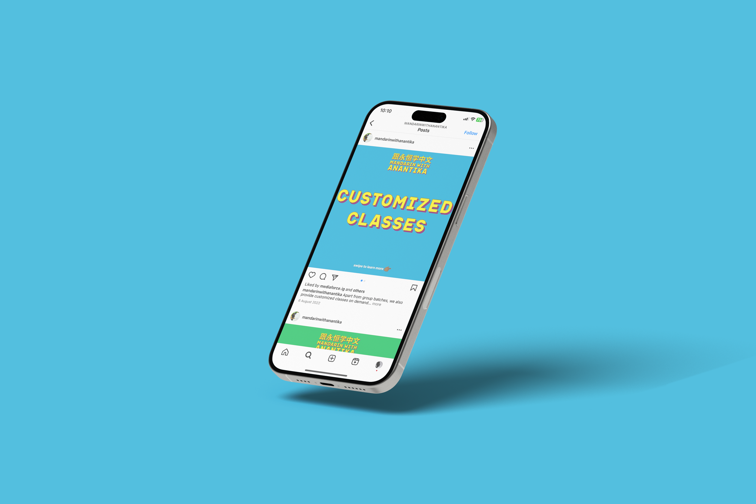
For this Mumbai based mandarin-teaching start-up, the challenge was to build a new look from scratch - one that would add character to and borrow from their central philosophy: to make learning Mandarin enjoyable, fun and non-intimidating.

For Anantika, it was important that we broke away from colours one might traditionally associate with Mandarin and Chinese culture in general: reds, blacks and yellows.
This led to a fresh new, vibrant look that was more playful and bold.
Final deliverables included a new logo, a succinct style guide and templates for social media.