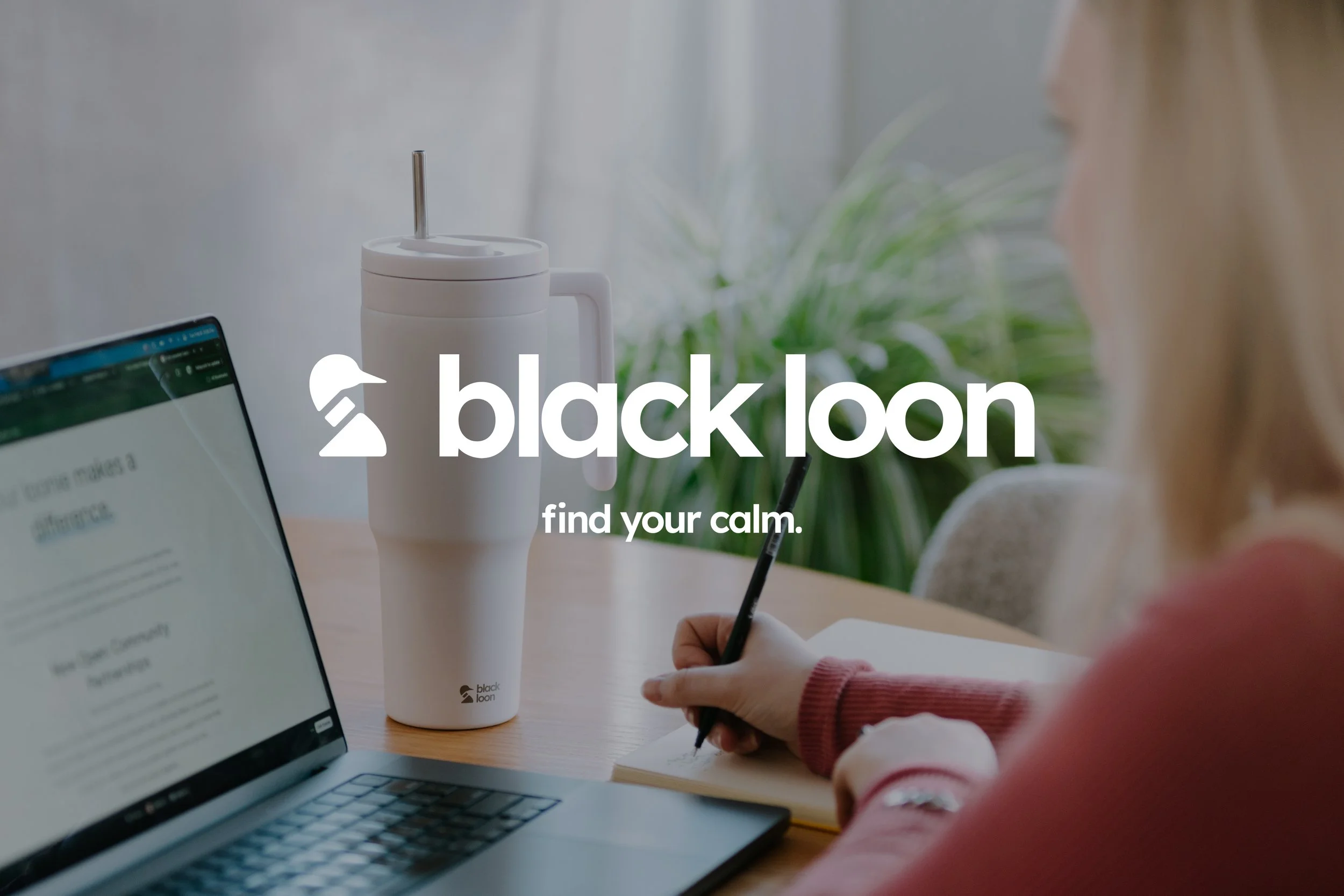
An identity for everyday drinkware, intentionally crafted.
A brand identity built for the in-between. Black Loon positions itself around intentional rest and everyday outdoor rituals, translating this perspective into a calm, minimal, and grounded visual system expressed across packaging, photography, digital touchpoints, and seasonal product storytelling.
Role: Creative Direction and visual identity spanning packaging, website and social.
-
Position a drinkware brand between lifestyle and performance outdoor brands.
-
The real outdoor experience is recreational—small, intentional moments of rest.
-
A calm identity for the everyday Canadian outdoors lifestyle, expressed through packaging, photography, and digital touchpoints.
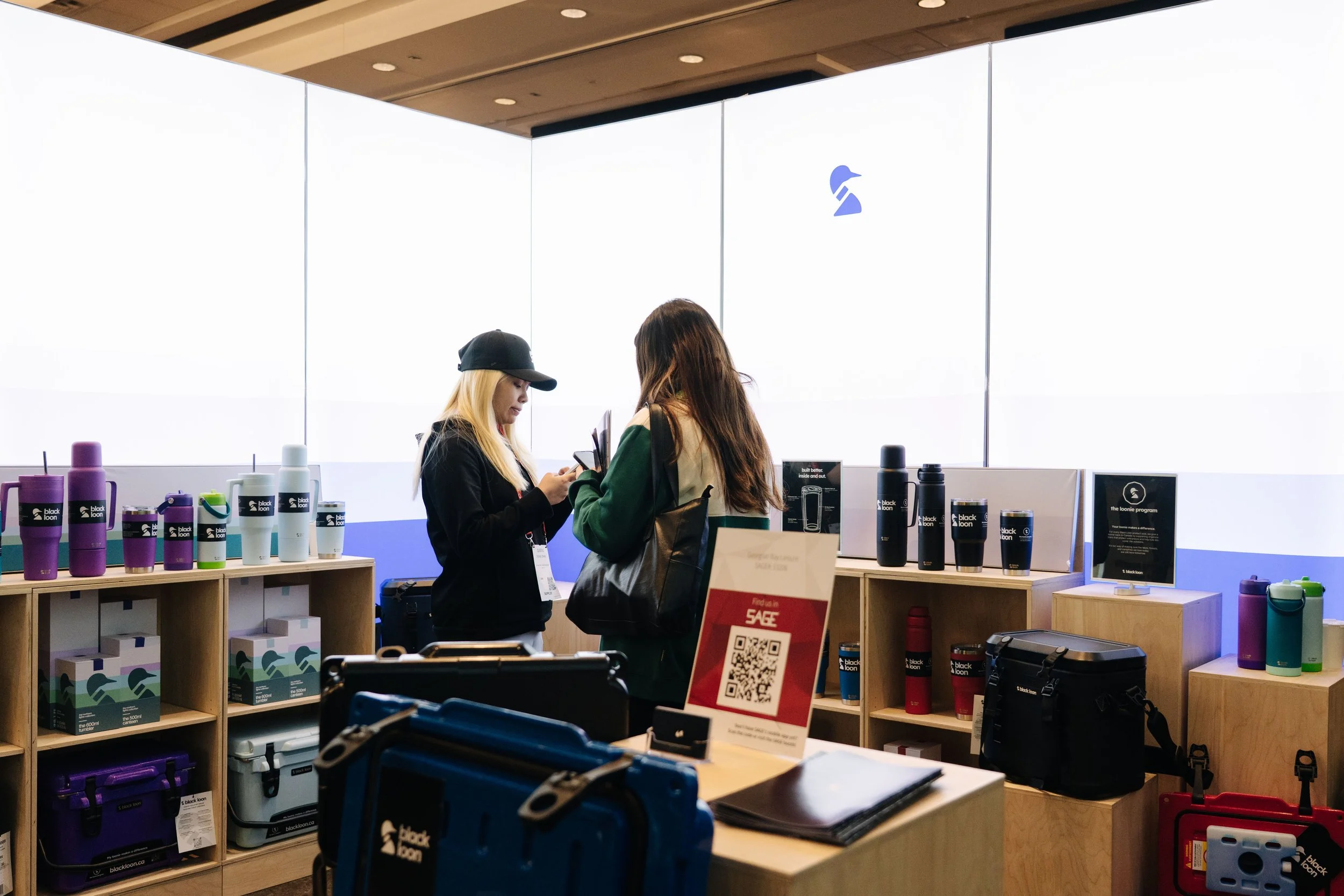
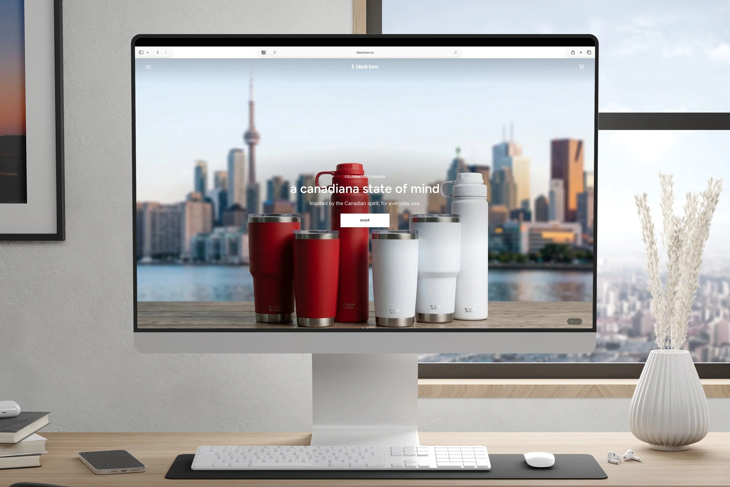
Website
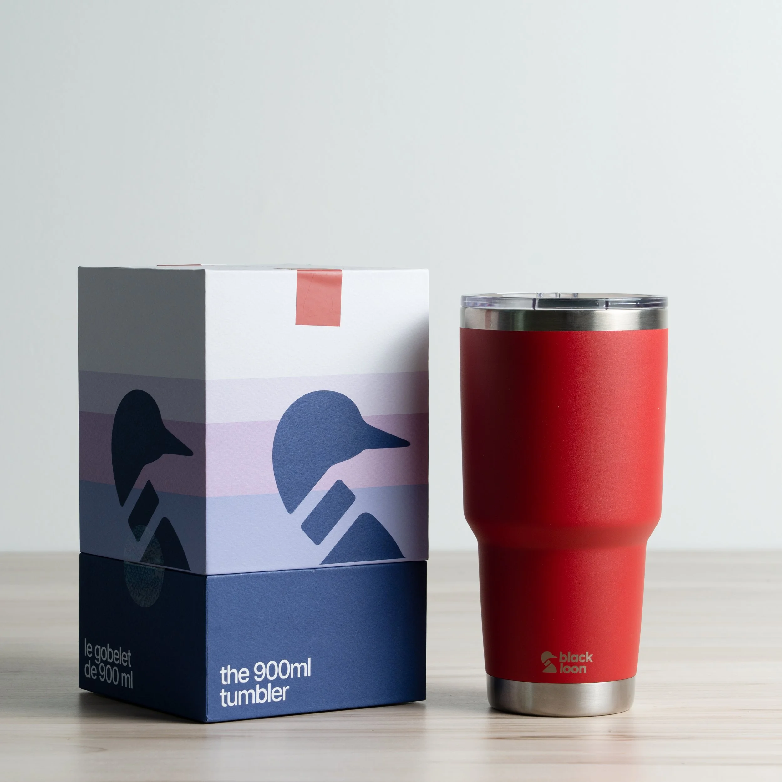
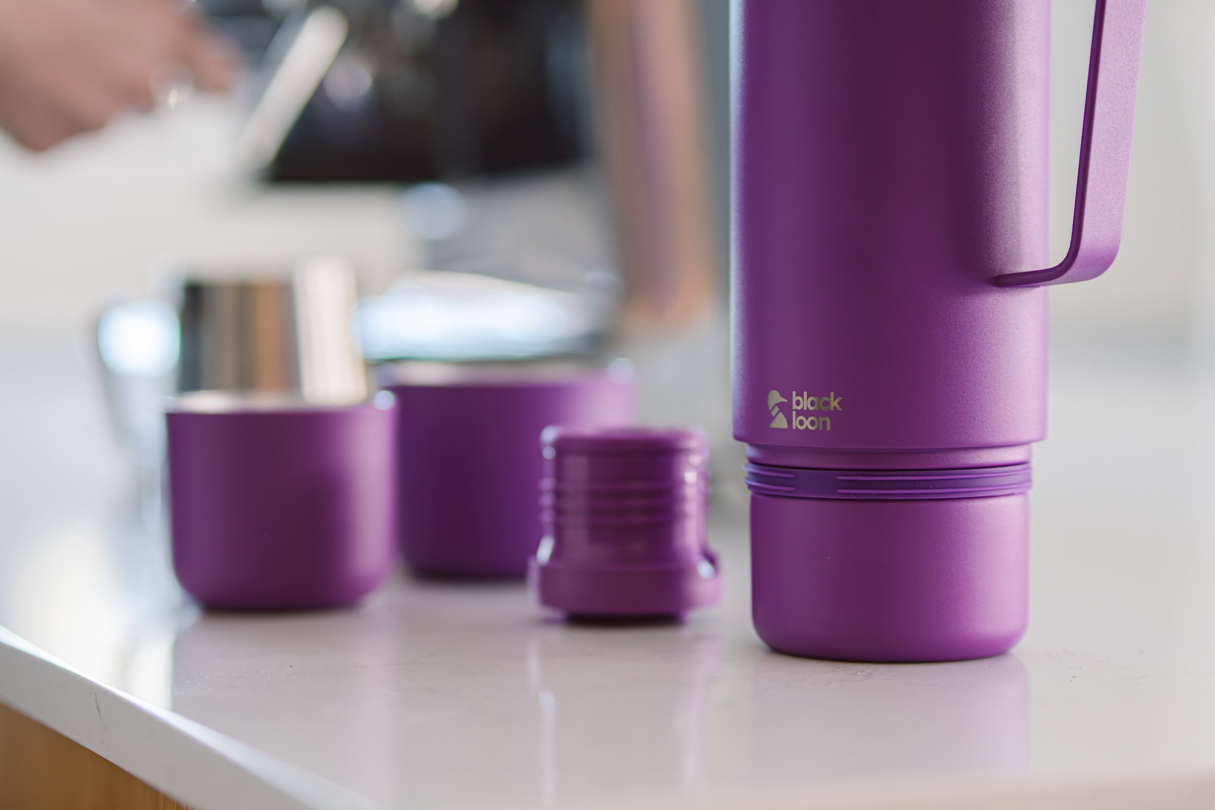
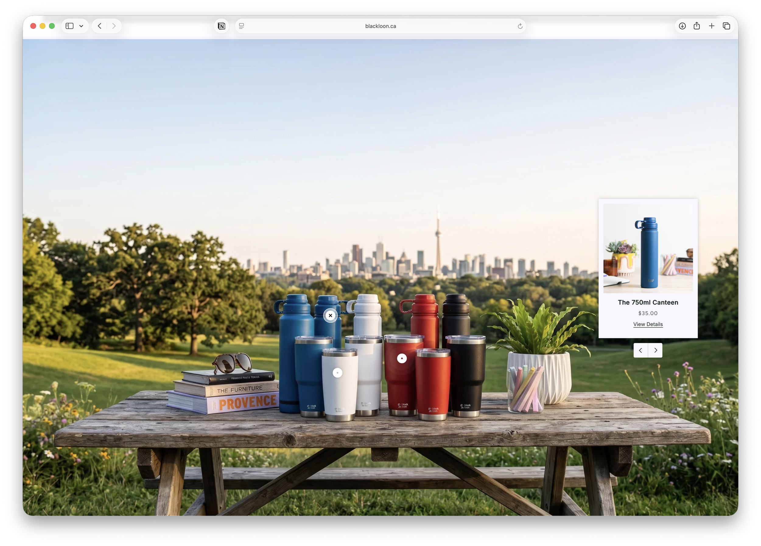
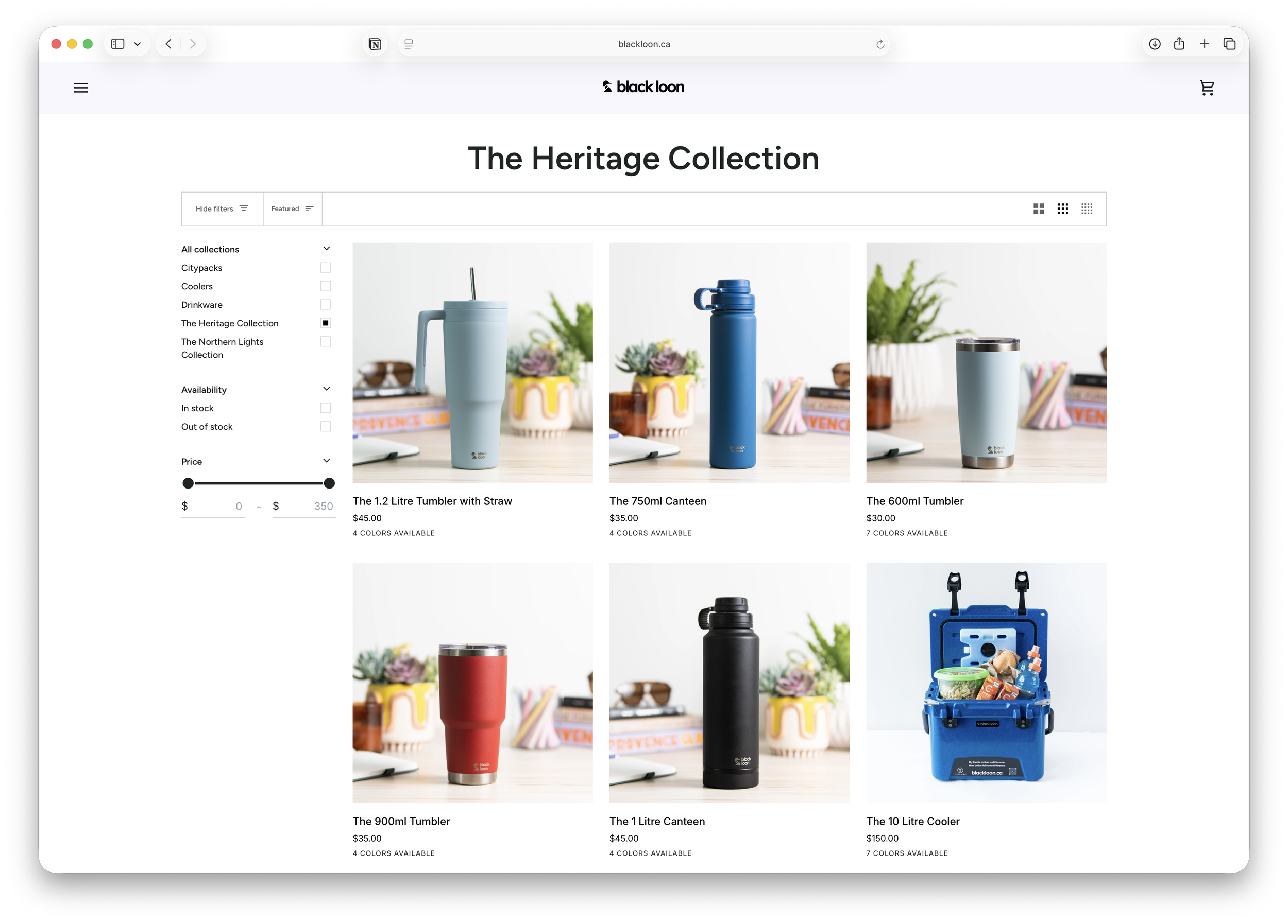
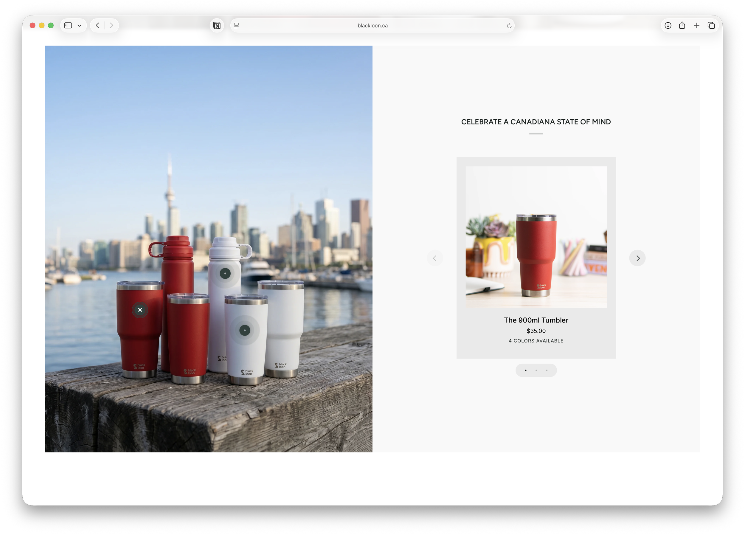
The website presents the two core collections through a clean, minimal layout that reflects the brand’s focus on clarity and intentional design. The Heritage Collection is grounded in classic Canadian colours—Birch White, Starry Night, Maple Leaf Red, and Superior Blue—supported by lifestyle imagery that evokes a quiet sense of pride and place.
Designed to feel uncluttered and functional, the interface mirrors the brand’s everyday utility, allowing the products and their context to take centre stage.

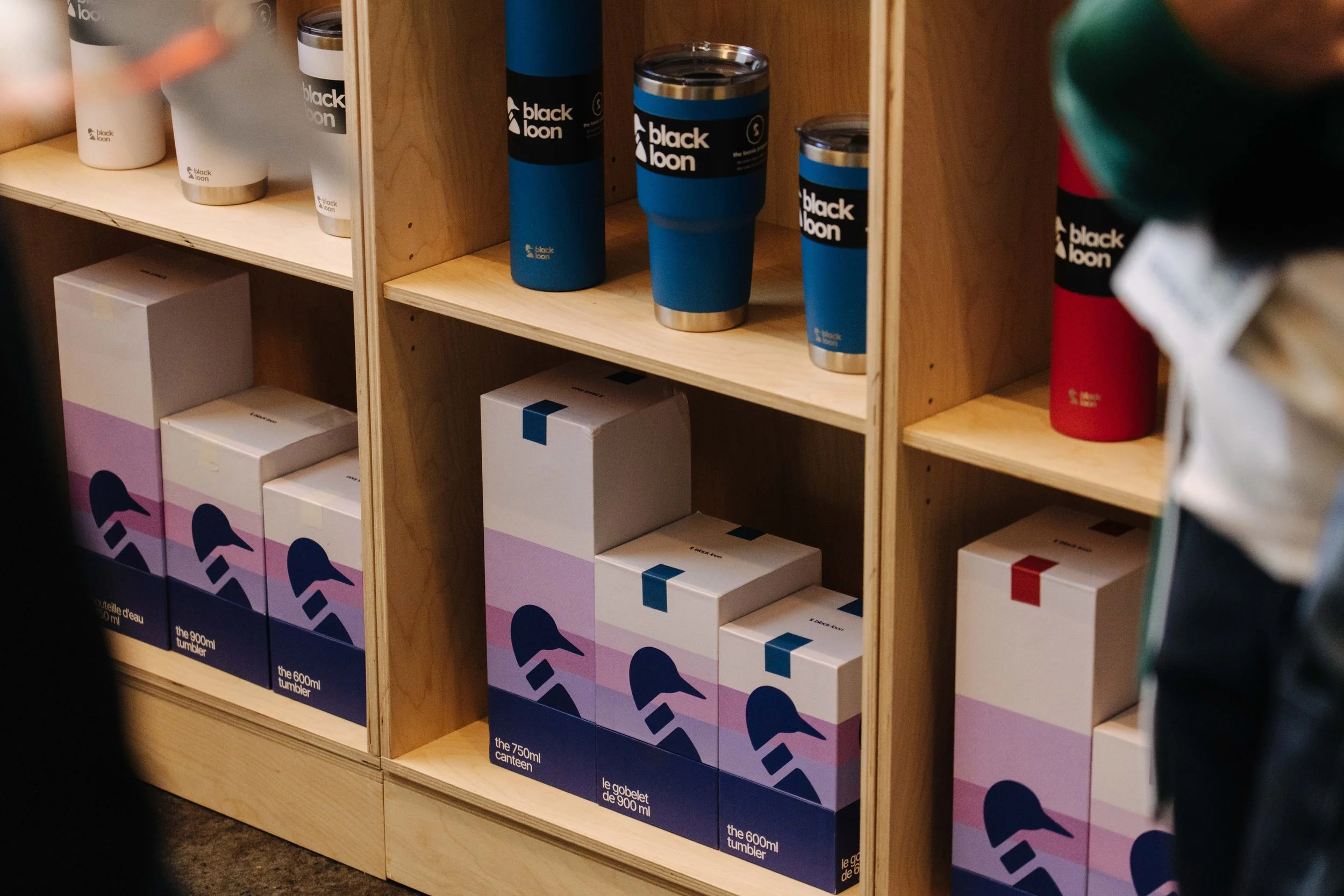
Packaging System
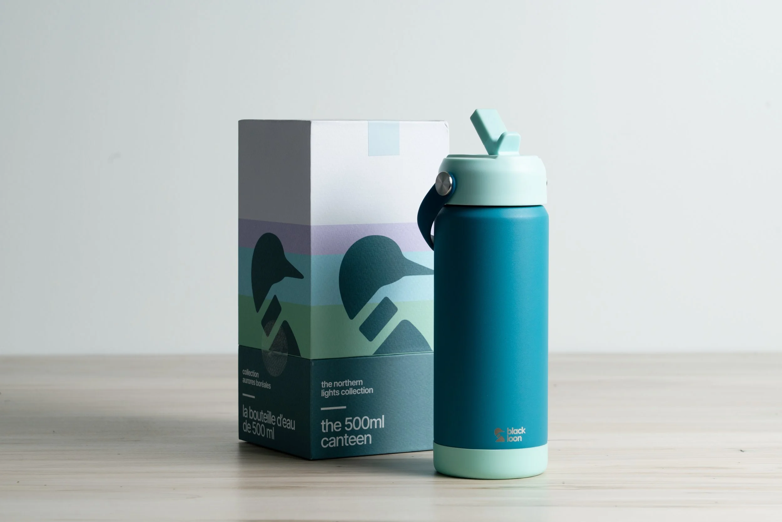
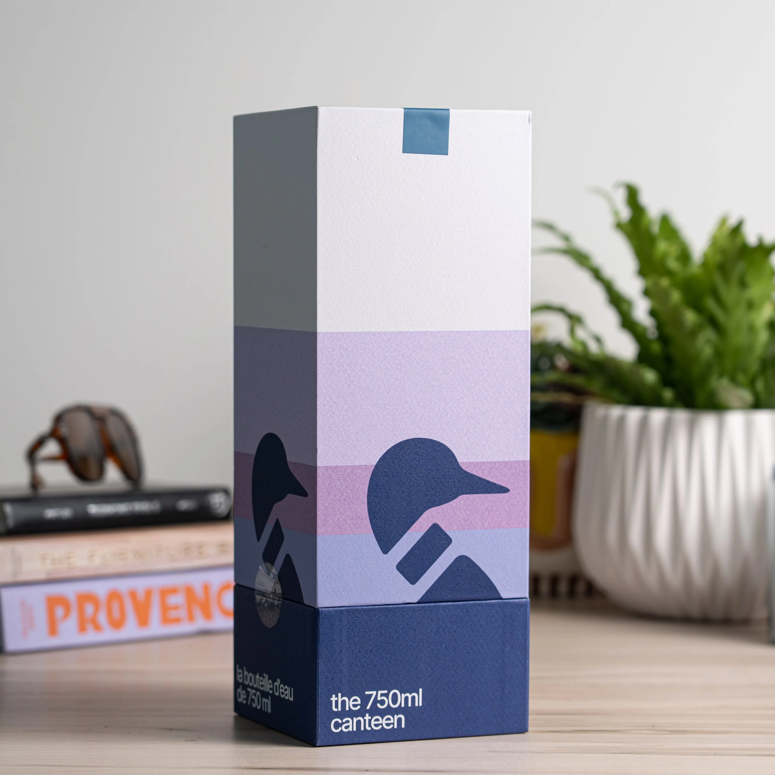
The packaging uses the Black Loon palette to build a minimal lake scene through bands of colour and a simple loon motif. Each box works individually, but when placed together, the striped landscape extends across surfaces—creating a larger retail environment. Despite varying sizes, the loon and scene stay consistently scaled, keeping the system unified.
For the Northern Lights drop, the palette shifts to teal and arctic ice blue, inspired by the aurora, extending the system into flexible seasonal colourways designed for future collections.